HandsOn!
UX/UI Design, Branding
Reimagining the real-world endurance 'hands-on' challenge for the digital realm, the project involved developing a bold brand and designing a fun and competitive app experience where the last contestant holding the prize wins.

The brand identity infuses a sporty and energetic aesthetic with bold, dynamic typography and a vivid brand color scheme, a look and feel that is mirrored in the app's icon, logo, and user interface design.


The UI/UX design adopts a strategic approach to typography, using clear and bold typography to guide players through the game flow, reinforcing the app's core challenge.


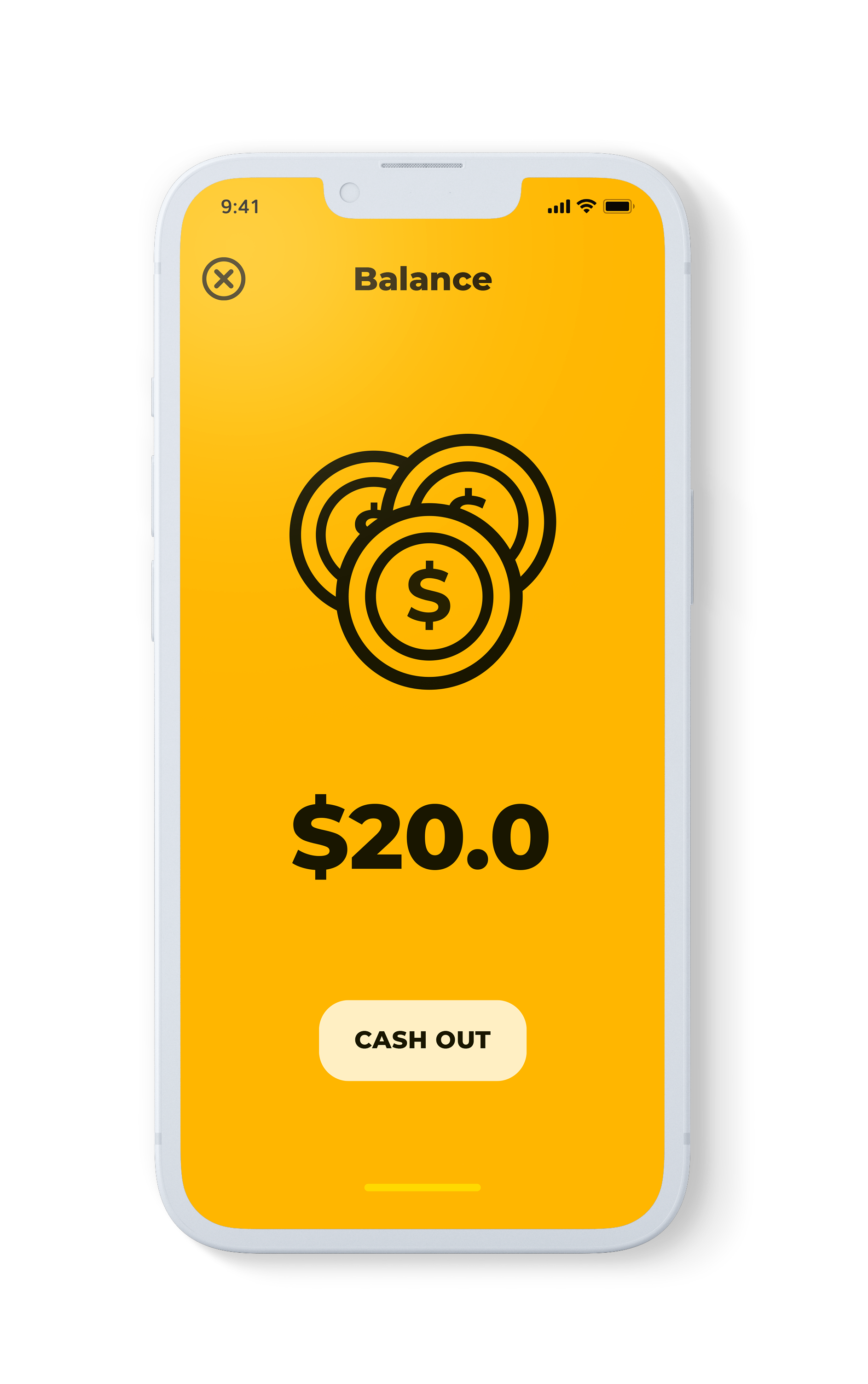
Seamlessly integrating user experience with monetization, the in-app purchase of Life Packs provides an exhilarating addition to gameplay while contributing to the business's revenue streams.