WalletWise
Branding, UI Design
The WalletWise design project encompassed branding and UI design for a smart electronic wallet app, aimed at managing finances effectively, while focusing on a user-friendly interface and financial efficiency.
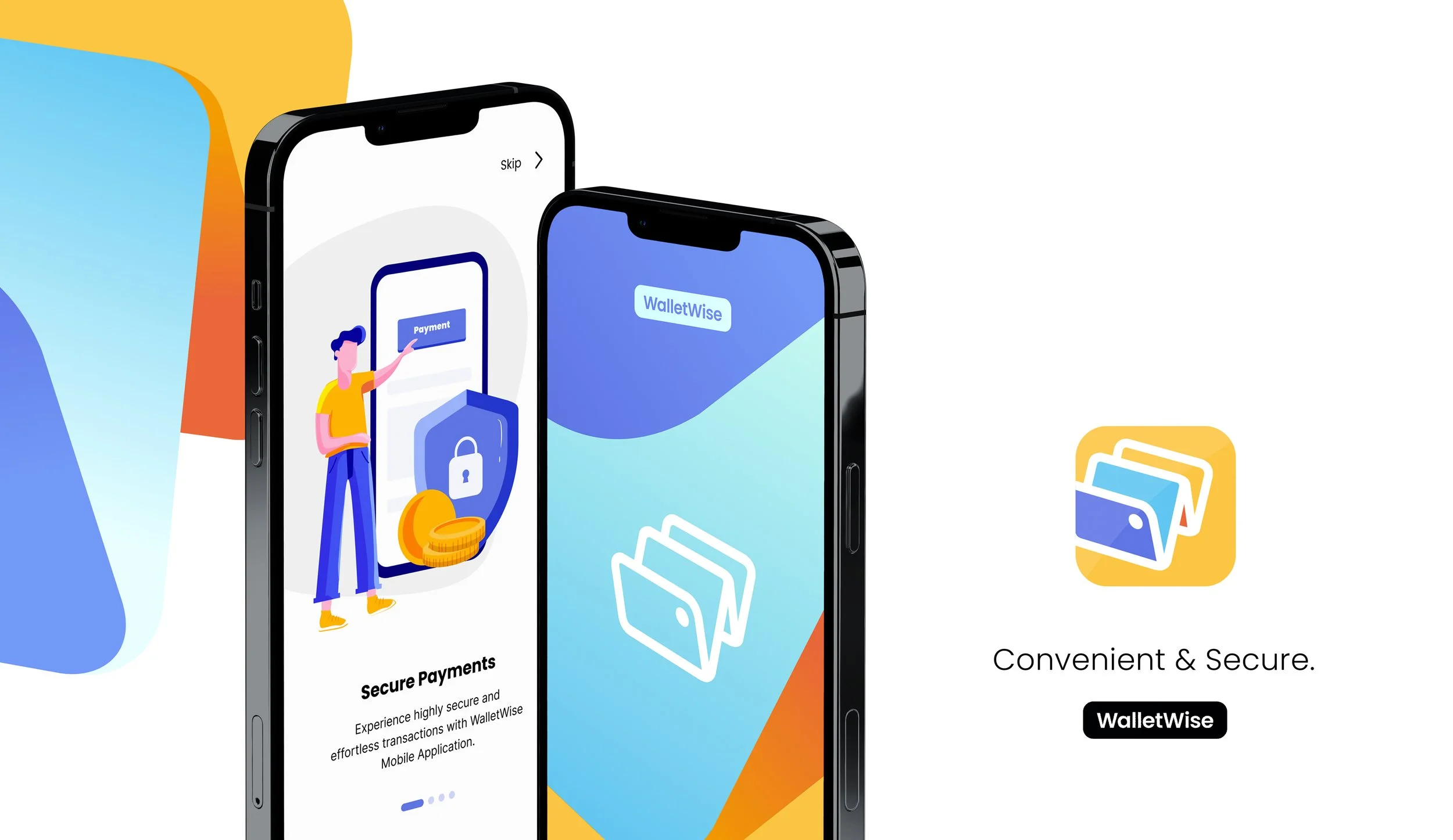
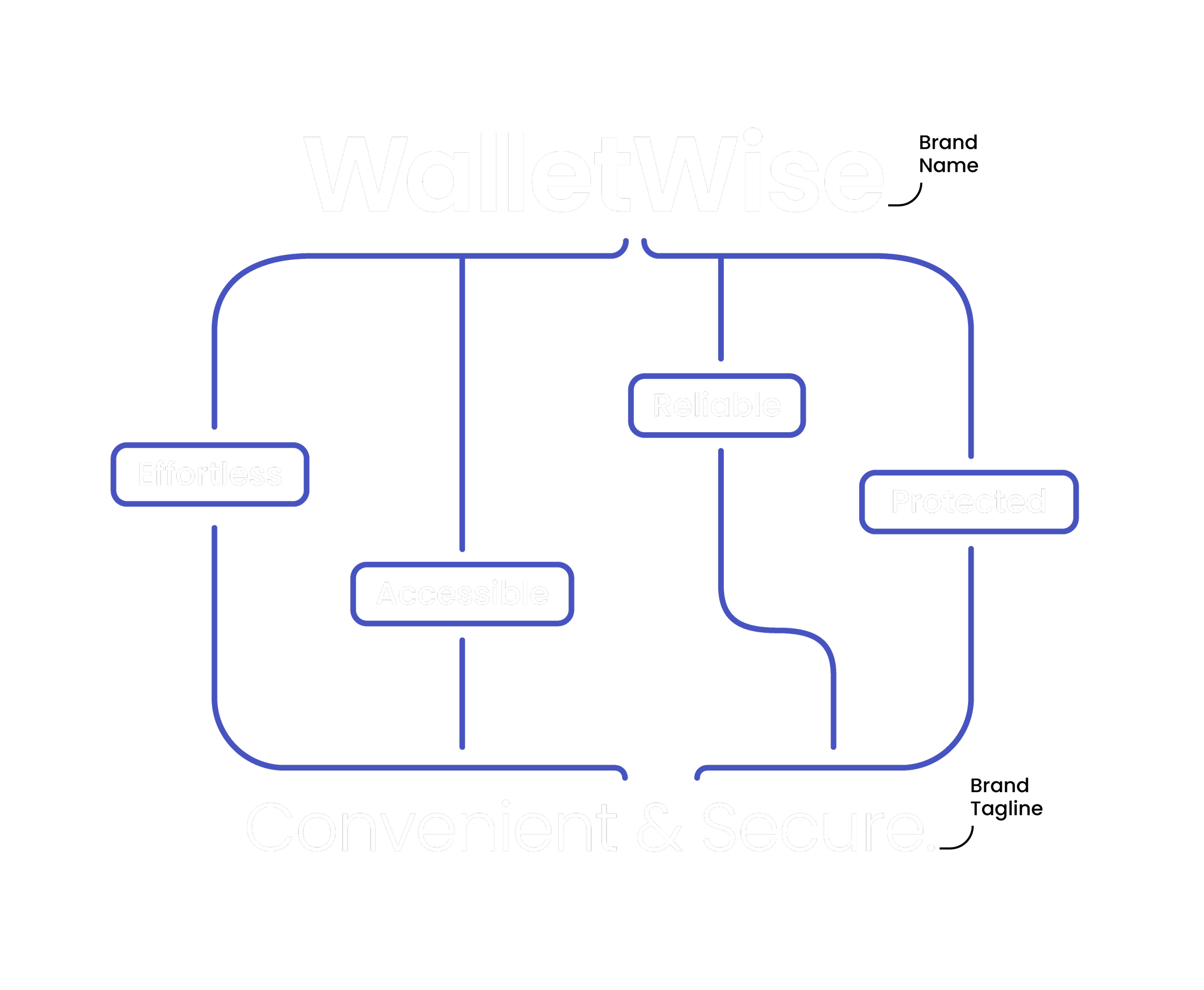
WalletWise, a brand name that encapsulates smart financial management, aligning with its 'Convenient & Secure' tagline, emphasizing wise, secure and efficient digital transactions.
Brand Concept
Logo Concept
The logo design combines an open wallet, symbolizing accessibility and usage, with the brand name initial letter 'W', creating a distinctive bold 'W' that represents the brand uniquely.
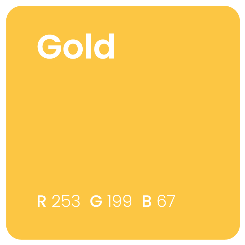
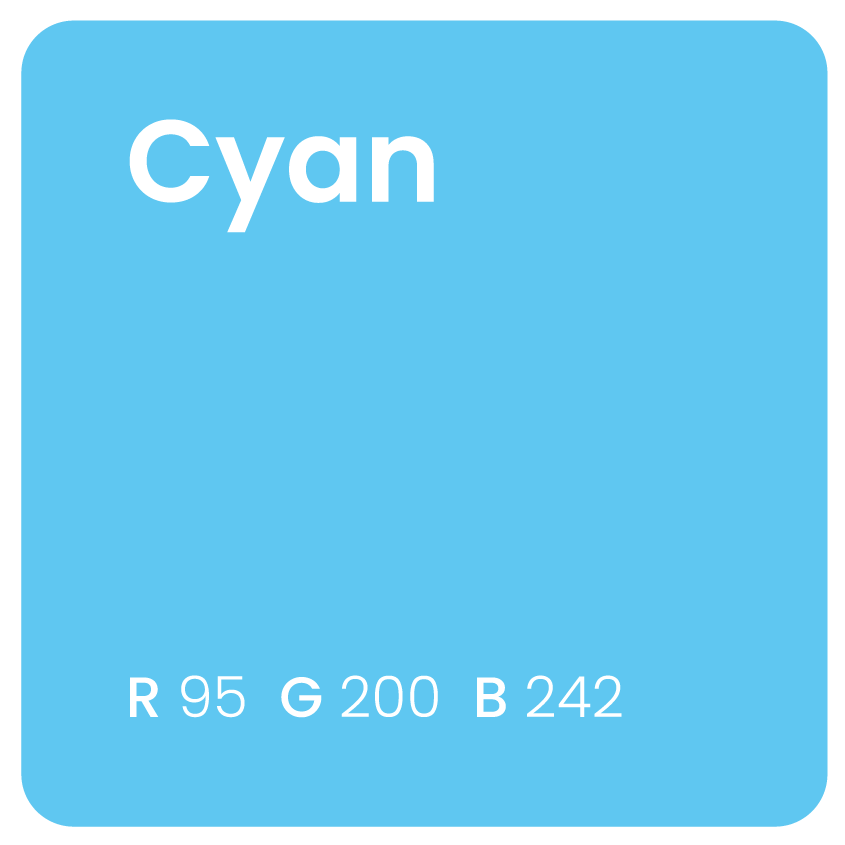
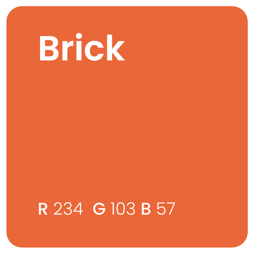
Color Palette

Full Logo
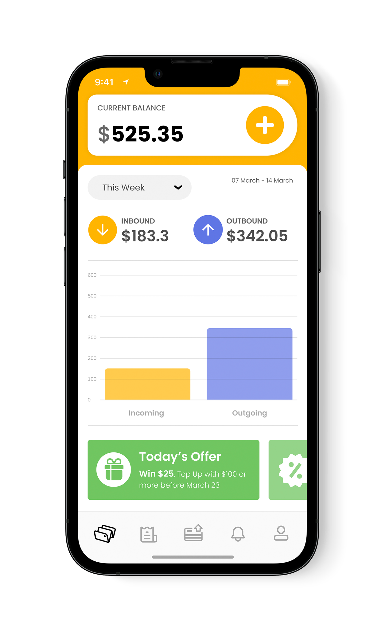


Outgoing transactions are color coded in Violet Blue to highlight the convenience aspect of funds transfers.

The account balance and incoming transactions are color coded in Gold to reflect the concept of prosperity.


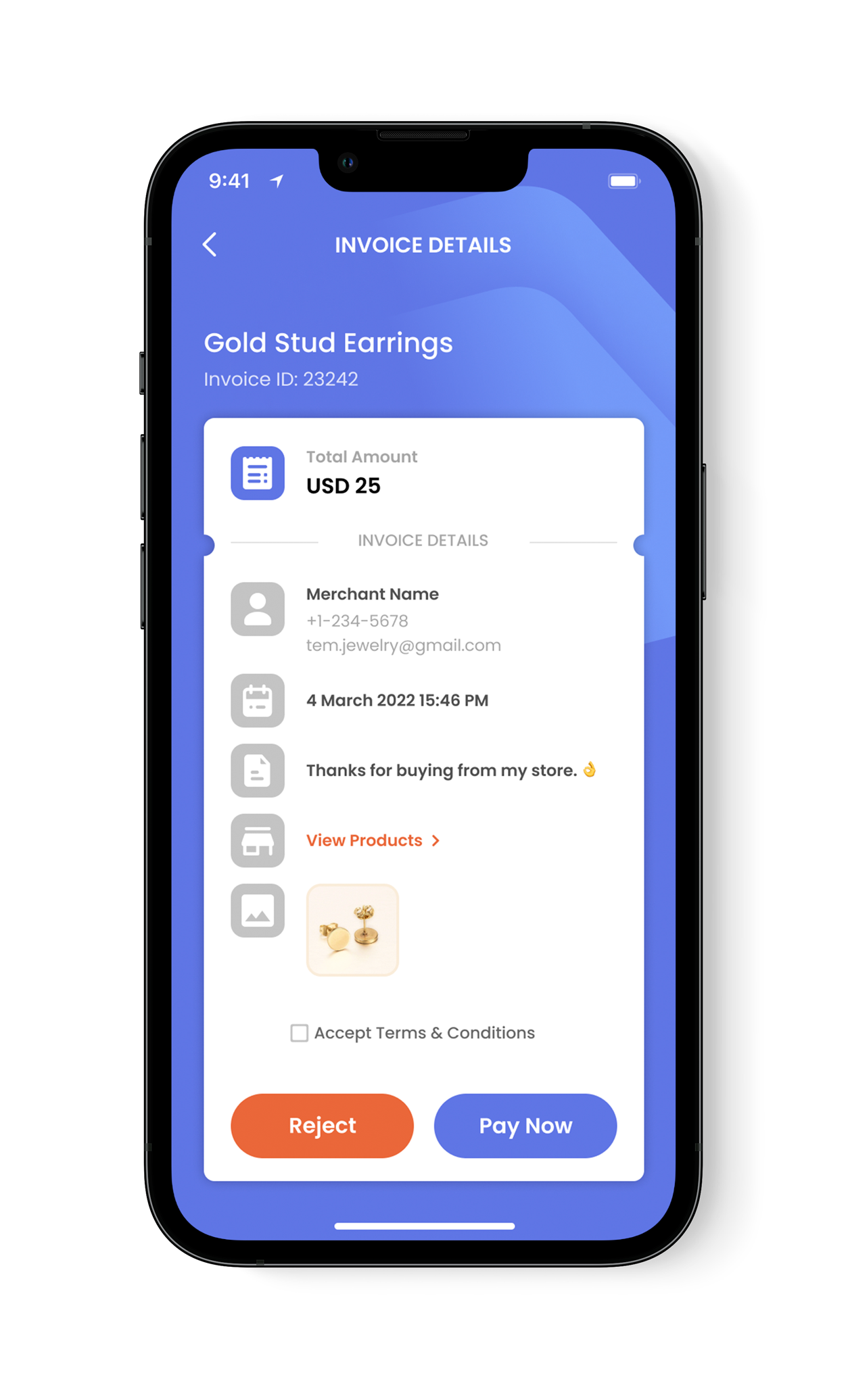

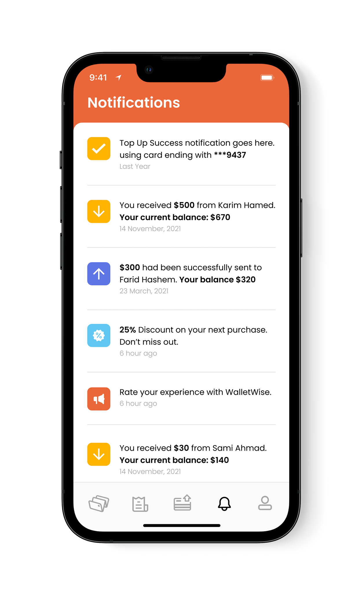
The visual brand identity, marked by a fresh color palette, clean san-serif typography, and bold iconography, encapsulates themes of wealth, clarity, and reliability. It's seamlessly integrated into the app's user interface, elevating both aesthetic appeal and user experience.
